
Start With The Fabric And Base Colour
The first check is always the substrate. Reds and pinks print best on the right polyester blend, with a clean white or very pale base giving you the strongest result. On darker garments or fabrics with too much off-white tone, the red can come back flatter and pinks can pick up a beige cast. For garment decoration, this matters even more on high-value runs where consistency has to hold from the first item to the last.
Before you start a full order, compare the fabric texture, weave and coating from batch to batch. A smooth, evenly coated item usually takes colour better than a rough or uneven one, and coastal humidity can make storage problems show up faster than expected. Keep stock in sealed boxes where possible, and avoid leaving blanks open near loading bays or windows. If you are buying for a store in Johannesburg, Randburg or Pretoria, plan for the same fabric type across the run so the reds do not drift.
Check Ink Compatibility Before You Chase More Colour
When reds look weak, many printers react by pushing settings harder. That can help for a moment, but it can also throw off pinks, skin tones and the rest of the palette. The better approach is to confirm that the ink suits the printer model, the printhead type and the transfer paper being used. A compatibility check saves time, waste and unnecessary head cleaning.
Our Kya Sand team often sees jobs where the colour issue was not the artwork at all. It was a mix of old ink in the lines, the wrong paper profile, or a print mode that was too light for the intended press. If you are working with desktop units or wide-format printers, keep your setup notes together so repeat orders are easier to match. That simple habit helps trade customers who print daily and need the same red on every batch.
- Confirm the ink matches the printer and head type.
- Use the same transfer paper for comparison tests.
- Check whether the last refill came from the same stock line.
- Record press time, temperature and pressure for repeat work.
Use Test Swatches To Tune Red And Pink Strength
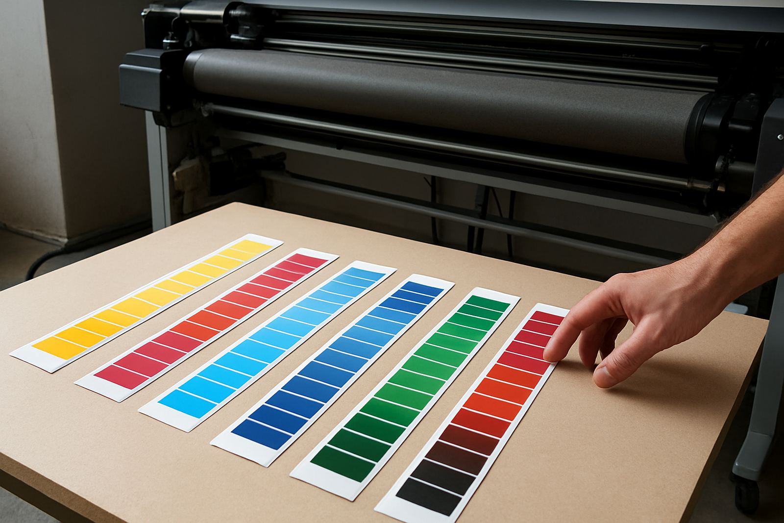
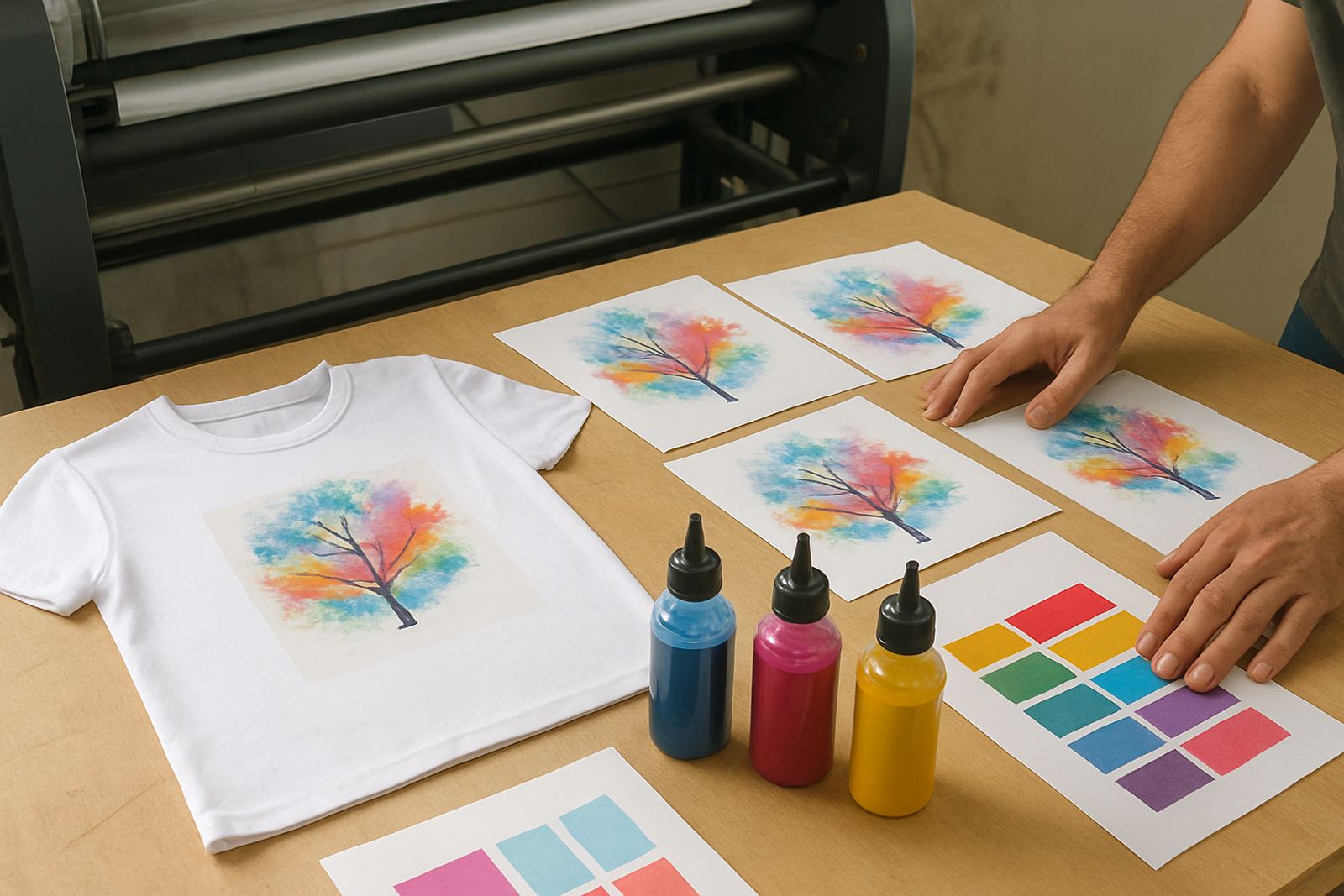
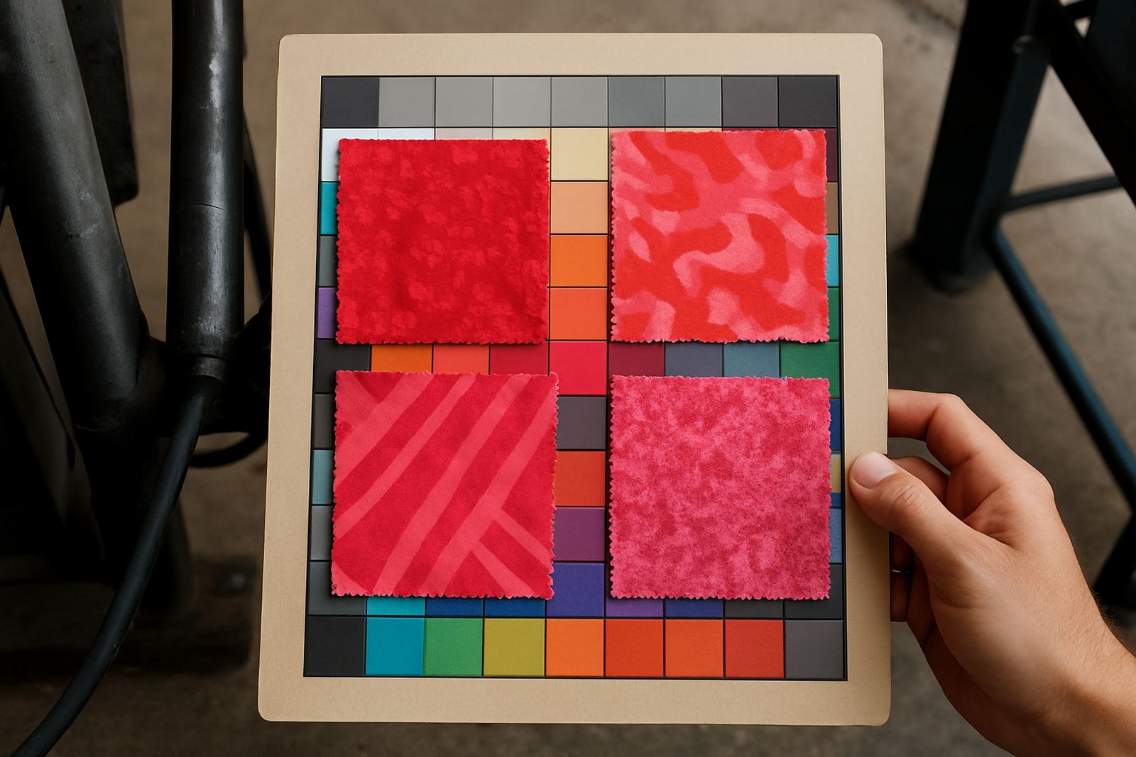
Do not jump straight into a full production run if the artwork leans heavily on reds or pinks. Print a small test sheet first and press at least two swatches with slightly different settings. That gives you a proper view of how the colour behaves once it has been transferred, cooled and washed if needed. On garment jobs, this is the easiest way to catch a red that looks too orange or a pink that lands too pale.
When checking swatches, look at them under daylight and under the lights you will use in the workspace. Fluorescent lighting can make reds appear colder, while a warm room can hide a pink that is too soft. Keep notes on each test, including the artwork file, paper side, and whether the sample was from a fresh line or from a printer that had been idle. This kind of record is useful for startup print advice and for larger trade customers handling multiple decorators.
- Print one plain red block and one mixed red and pink block.
- Press with your normal settings, then adjust only one variable at a time.
- Check both immediate colour and the cooled result.
- Keep a sample strip for future stock planning.
Keep The Printer Clean And The Lines Moving
Strong reds need stable flow. If the lines are partly blocked or air is sitting in the system, reds often show the problem first because the colour shift is easy to spot. Line cleaning advice should be part of normal maintenance, not only something you do after a fault. In busy shops, especially where orders move between screen printing and sublimation, it helps to set a weekly cleaning routine and stick to it.
Load-shedding also affects print quality more than many people expect. If the machine sits idle between power cuts, ink can settle and the first print back may be weak. Keep the printer covered when not in use, and if there has been a long stop, run a short test before starting the real job. A small note here: it is better to catch a weak red on paper than on 200 finished garments. If the nozzle check is uneven, do not force a production run. Clear the issue first.
Balance The Artwork So Reds Stay Strong Without Spilling Over
Good red and pink work is not only about the ink. The layout needs balance too. If the design is packed with warm tones, the reds can overpower other parts of the artwork and make the image look heavy. Use contrast carefully and give lighter sections enough space so the eye can rest. In a clothing print, that keeps the design readable from a distance and close up.
For mixed-colour pieces, ask whether the red is meant to lead the design or support it. If it is a logo, the red may need to be exact and fairly solid. If it is a full artwork, a softer pink or muted red can be easier to live with on the final garment. Consistency advice is useful here because once you set a standard, the next batch should follow the same result rather than shifting from order to order.
Stock Planning For Busy Shops And Courier Orders
Reds and pinks are colours that run out quickly because they are used in logos, fashion runs, school items and seasonal promotions. If you print often, do not wait until the bottle is nearly empty. Stock planning should include expected weekly usage, backup quantities and the lead time for next-day courier to places like Sandton, Midrand, Roodepoort, the East Rand and Pretoria. That gives you room to keep jobs moving even when the workshop is busy.
At our Johannesburg base in Kya Sand, we support trade customers who need reliable supply and straight answers on order sizes. Bulk order support helps larger operations, while sample order assistance suits smaller businesses testing a new product line. If you need courier coordination, keep the delivery address and receiving times clear so stock arrives when the team can process it. A smooth supply line matters when a red run must go out before the weekend.
- Keep at least one spare bottle for your highest-use red.
- Review weekly usage before placing a replacement order.
- Match stock levels to upcoming events, retail launches and school deadlines.
- Plan for courier cut-offs, especially before public holidays.
What To Do When Red Still Looks Flat
If the red stays flat after the usual checks, go back step by step. Confirm the file is correct, check the paper, test the press settings, and make sure the printer has not been sitting idle too long. Sometimes the issue is as simple as an old profile being reused for a different blank. Other times the mix of heat, pressure and humidity has changed enough to shift the finish.
When in doubt, compare the problem print with a known good sample from your own records. That is often the quickest way to see whether the issue is in the artwork, the ink flow, or the pressing stage. Our team can help with colour troubleshooting, refill guidance and trade customer support, whether you are running a small setup or handling repeated production jobs across several sites.