
Start With The Swatch Under The Right Light
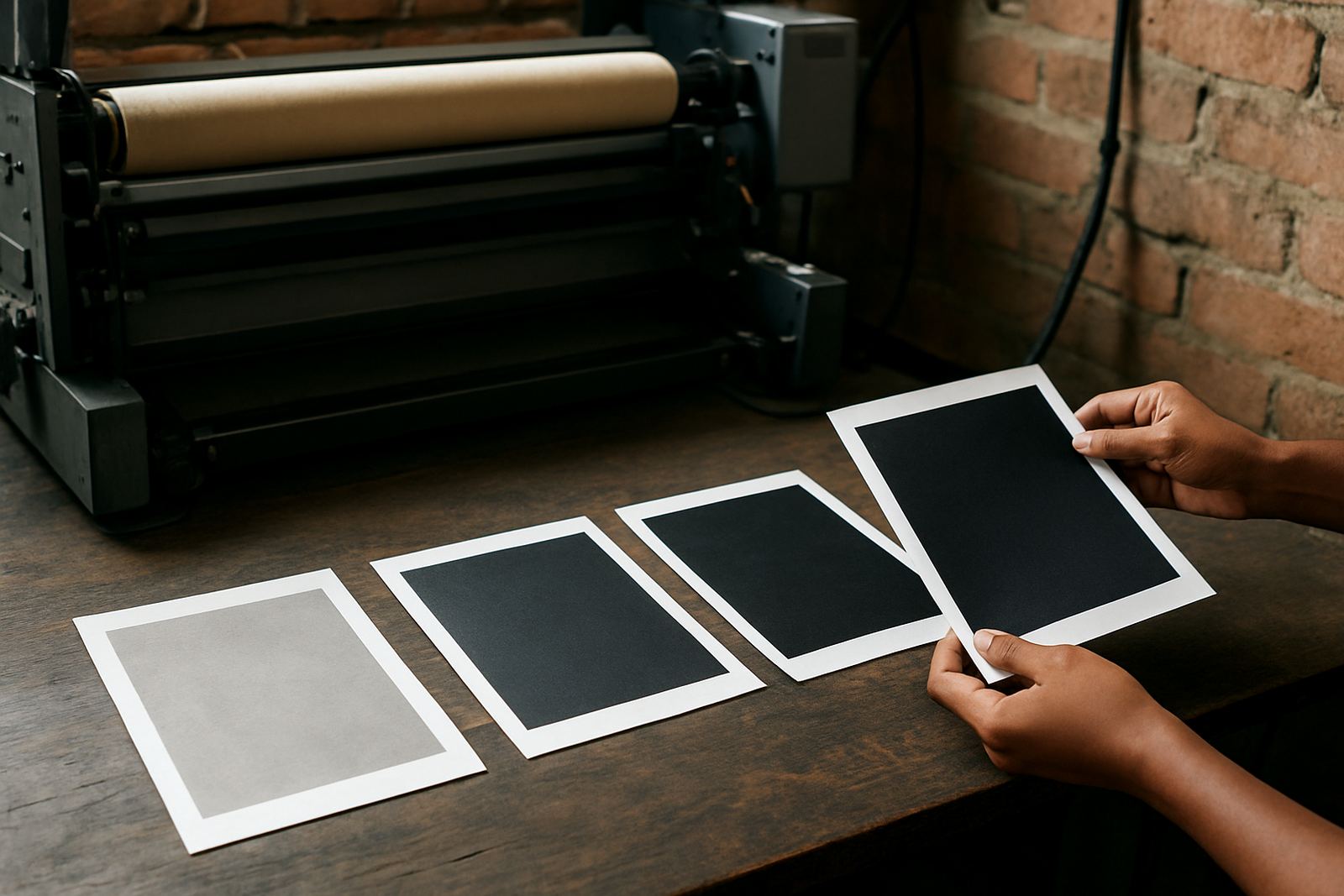
A swatch only tells the truth when you view it properly. Natural daylight is best, but not direct sun, because strong glare can make bright colours look cleaner than they really are. In a Kya Sand work area or a shop with mixed lighting, compare swatches near a window in the morning and again under your normal indoor lights. If the colour shifts a lot, note it before you approve the job.
Hold the swatch at the same distance you expect customers to view the finished item. A neck label, for example, is judged differently from a full chest print or a large transfer. On dark garments, the base fabric can change the way a swatch reads, so check it against the actual material where possible. Small differences show up quickly once heat and pressure are involved, so dont rely on memory alone.
Read Vibrancy, Not Just Brightness
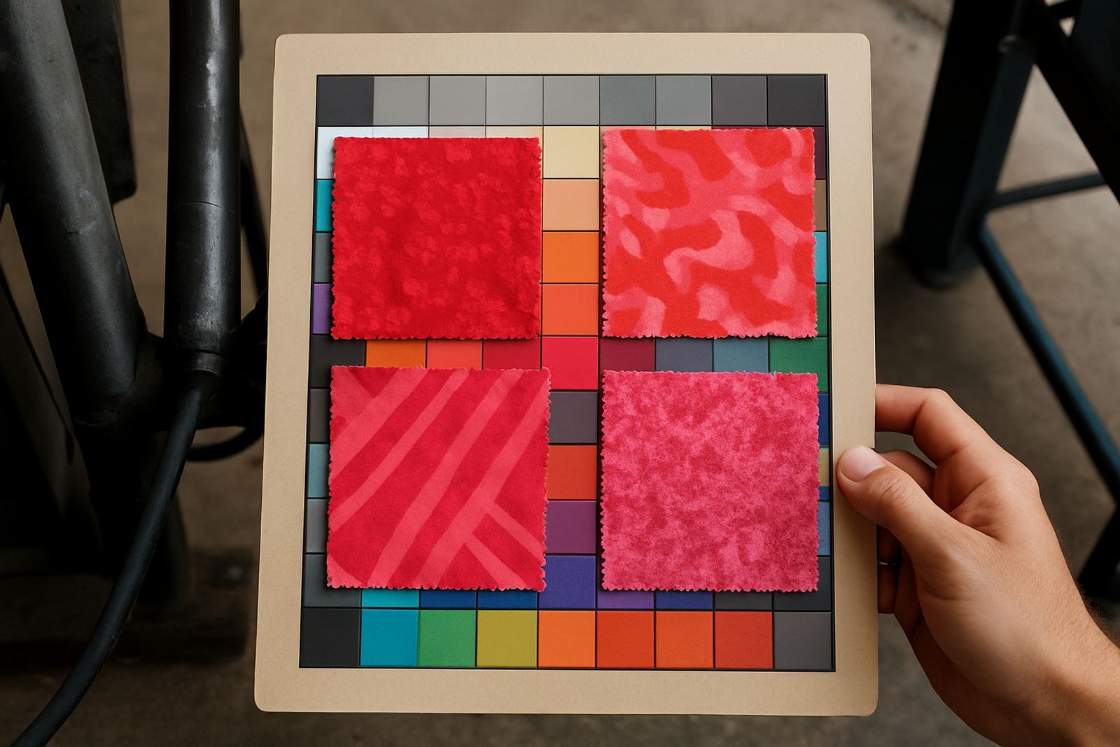
Vibrancy is the first thing most people notice, but brightness alone is not enough. A strong yellow that looks sharp on paper may lose punch on a polyester blend if the heat press setting is too low, or if the substrate carries moisture from coastal storage. The same can happen with reds and blues when the ink load is uneven. A good swatch should show how the colour behaves, not only how it looks at first glance.
Look closely at whether the colour feels rich, flat, or washed out. Check if the edges stay clean and whether fine detail is still visible. If a swatch appears over-saturated, it may still print beautifully on small logos but become heavy on large graphics. If it looks slightly muted, that may actually suit corporate wear or supplier uniforms better, where tone consistency matters more than flash. This is where experience saves a lot of rework.
- Compare the swatch beside a known reference colour, such as a previous approved job
- Check for colour cast, especially in whites, greys and skin tone prints
- Look at small text and thin lines to see if detail holds up
- Confirm that the same colour looks similar across more than one sample
Check Balance Across The Full Colour Set
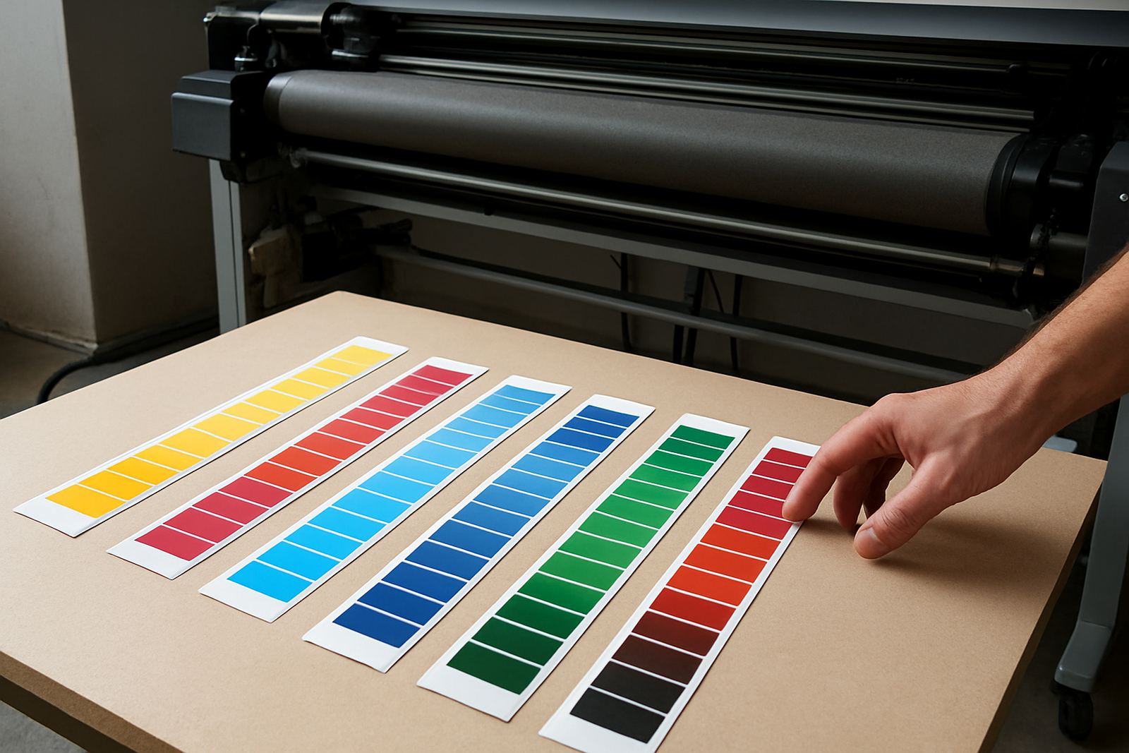
A swatch set should not only be strong in one colour and weak in another. Balance means the full range works together, so a black, cyan, magenta, yellow and other mix lines all sit in a sensible range. If one colour looks far warmer or cooler than the others, the final job may look uneven even when each colour by itself seems fine.
Balance is also about how the colours blend. Gradients, shaded logos and photographic work need smoother transitions than simple block text. For garment decoration and screen printing work, it helps to compare a swatch sheet with a mixed sample rather than only single tones. If the middle tones muddy up, the blend may need adjustment before you run a bulk order. This is especially important when you are matching repeat jobs for a trade customer.
Look For Consistency Between Runs
Consistency is the part that protects your margins. A good swatch tells you whether the ink repeats the same result from one batch to the next. If you are planning a larger run, keep one approved swatch and compare every fresh sample against it before you begin. Even a small shift in colour density can create problems when you are doing uniforms, promotional wear, or customer repeat orders.
When checking consistency, pay attention to the same paper, same printer settings and same heat press conditions. If any of those change, the result can change as well. This is where many printers get caught out during load-shedding periods, when power interruptions can affect workflow and drying times. A simple pre-run swatch check helps you spot issues before you commit to the whole batch and have to explain a colour mismatch later on.
- Use the same substrate for every comparison
- Mark the date, printer and settings on each approved sample
- Keep one master swatch for repeat work
- Recheck colour after long storage, heat or humidity changes
Match Swatches To The Job You Are Printing
Never judge a swatch in isolation. A colour that works for a sports shirt may not suit a mug, sign panel or heat transfer paper run. Different materials pull colour differently, and the same ink can look cleaner on one surface than another. If your business handles mixed work, create a simple habit of matching the swatch to the actual job type before quoting or printing.
For small businesses, this can mean keeping separate notes for polyester garments, coated products and sample cards. For larger operations, it helps to record the swatch against the order line so your team can repeat it later. If you are supplying clients across Johannesburg, Pretoria or further afield, that record keeps your colour decisions straight even when jobs are split between production days. It also helps when a customer asks for the same shade again months later.
A Practical Swatch Checklist Before You Approve Stock
Before you place a bigger order or start a production run, use a short checklist so nothing gets missed. It does not need to be complicated, just consistent. The aim is to confirm that the colour, handling and repeatability are good enough for the job at hand. If something looks off, it is cheaper to pause and verify than to continue and scrap material later.
- Check the swatch in daylight and under your shop lights
- Compare it to the actual garment or substrate
- Confirm colour strength, balance and edge sharpness
- Test one small print if the job is large or time-sensitive
- Review drying, heat press and storage conditions
- Record the approved sample for the next repeat order
Trade customers often need both speed and certainty, so a short approval step is worth it. When stock is moving fast from Kya Sand to Randburg, Roodepoort, Midrand, Sandton, Pretoria and the East Rand, a clear swatch process keeps orders on track and helps you plan courier dispatch without last-minute changes. It is a simple habit, but it saves a lot of grief.