
Start with the file before you touch the printer
Good dark tone control begins in the artwork file. If the blacks are too heavy, too cool, or built with random shadow settings, the printer will simply reproduce the problem. Check the image in RGB or the final print colour space you use, then look closely at the darkest 10 to 15 percent of the image. That is where detail is often lost first.
For garment decoration and screen printing work, a clean source file saves time later. Avoid crushing shadows in the original design unless the effect is deliberate. If the artwork already has deep blacks, reduce the density a little and compare a test print against the original on a light transfer sheet. It is easier to add depth than to recover detail once it is gone.
- Check shadow areas at 100 percent view.
- Remove unnecessary contrast boosts.
- Keep skin tones and dark fabrics from merging together.
- Watch for banding in gradients around black.
Set the black channel for the job, not just for speed
Black density is not only about making the image darker. Too much black can make faces look hollow, clothing details disappear and shadow areas appear greasy on transfer paper. Too little black and the print looks weak, especially on bold graphics and text-heavy work. The right balance depends on the printer, the substrate and the final use.
For desktop printers, start with a small test run and compare two or three settings. On wide-format machines, check the black build in the driver and RIP profile if you use one. In a humid Kya Sand workshop or a coastal area where paper picks up moisture, the same setting can behave differently from one day to the next. Keep the paper sealed and let it sit in the room before printing, otherwise the result can shift in a way that is hard to trace.
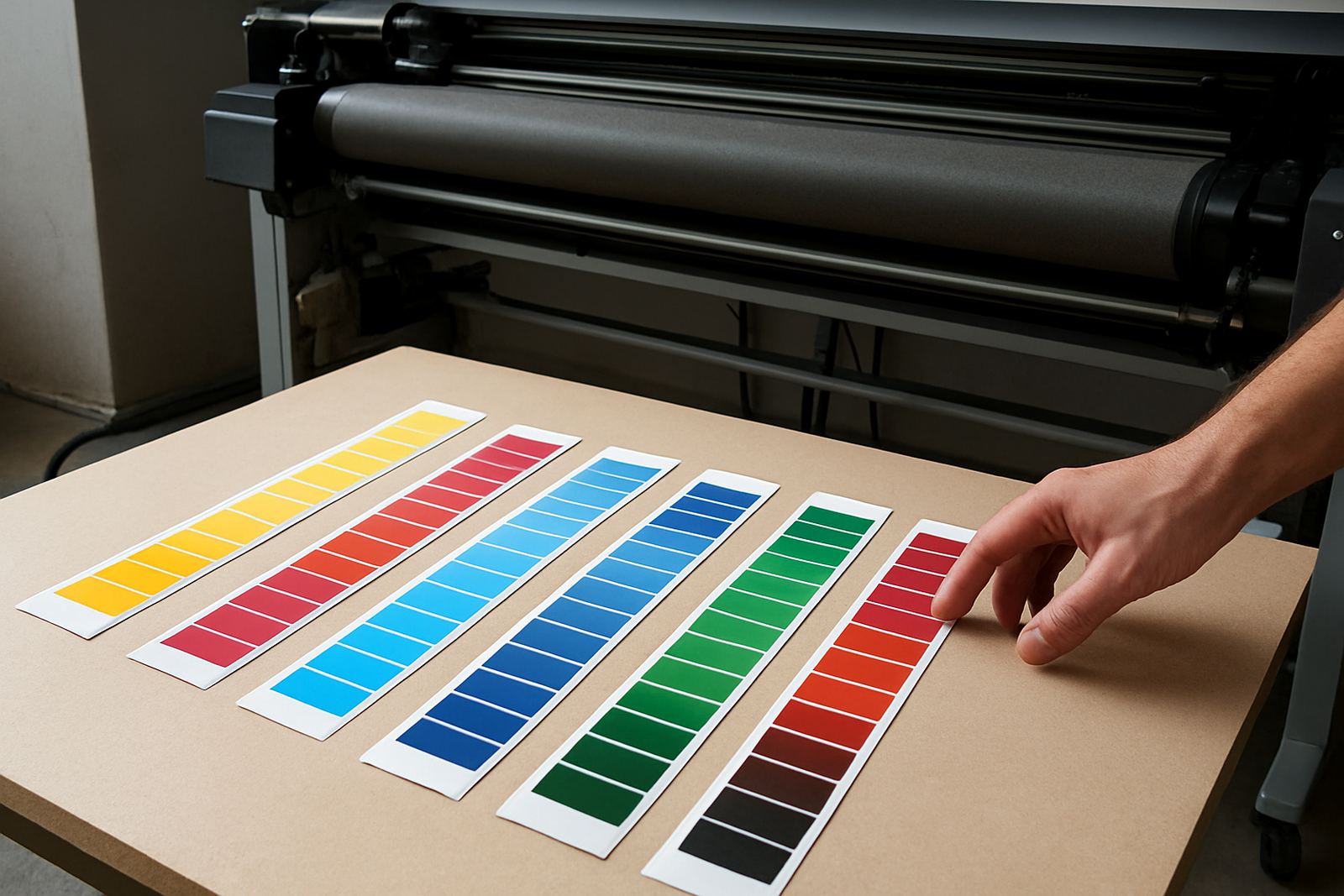
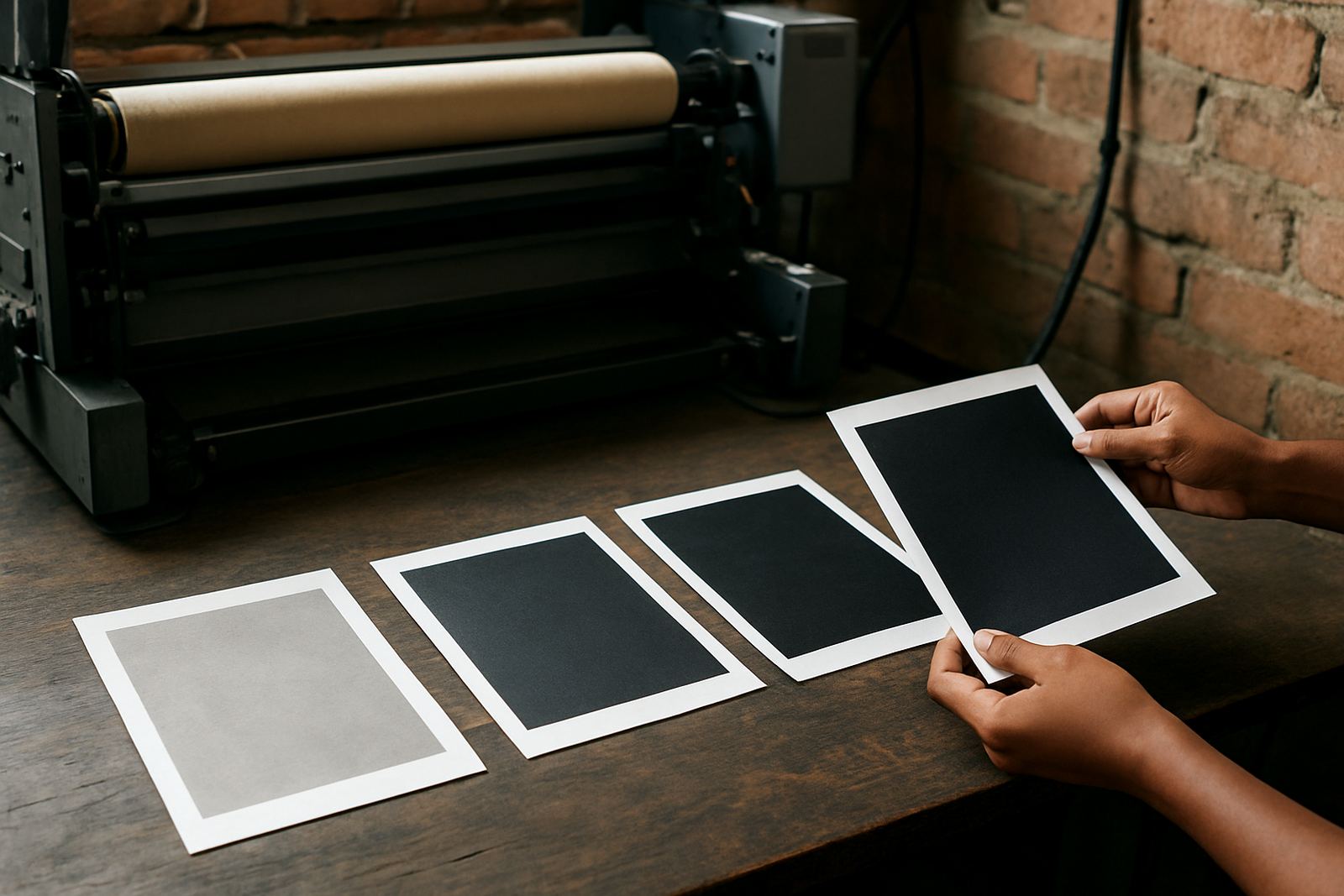
- Use a test strip with shadows, greys and solid black blocks.
- Compare one setting at a time.
- Store paper flat and sealed.
- Record the best setting for each media type.
Use colour balance to protect the shadows
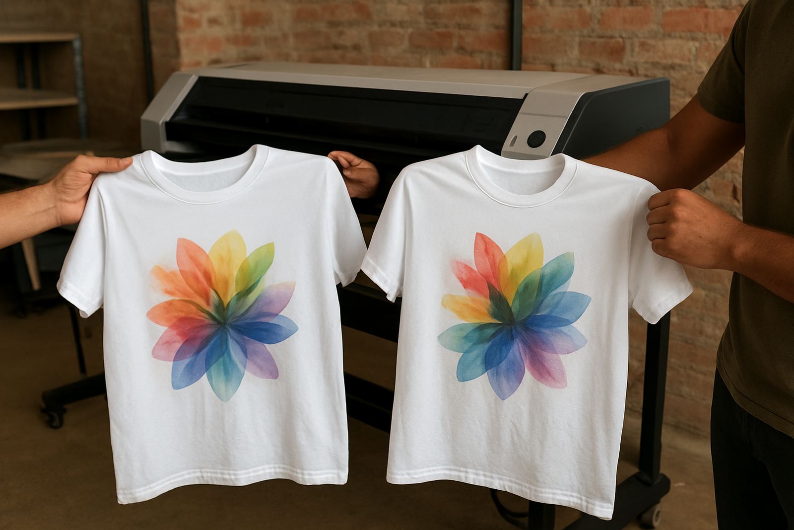
Dark tone control is not only about black ink. When cyan, magenta and yellow sit out of balance, the dark areas can take on a red, green or blue cast. That shows up fast in apparel prints where the black should stay neutral. The fix is usually in the file or the profile, not by forcing more ink into the page.
Look at neutral greys first. If grey patches drift warm or cool, the shadows will follow. Slight changes in balance can give better depth without making the print heavier. Keep an eye on the transition from midtones into black, because that is where many prints start to lose structure. If the gradient is smooth and the darkest areas still hold shape, you are on the right track.
When running repeated jobs for trade clients, keep one reference print from the same batch. It gives you a quick way to see whether the new run matches the approved tone or whether the darker areas have shifted.
Match the ink load to the paper and press settings
Even with the same design, a change in paper, press temperature or dwell time can change how dark the finished transfer appears. More heat can pull more colour, but it can also flatten detail if the image was already dense. Less heat may leave the dark areas looking dull or patchy. Treat the full process as one system.
For best results, keep your settings consistent from job to job. If you must change paper stock, adjust in small steps and note the outcome. In Johannesburg winter air can be dry, while summer afternoons bring dust and moisture swings. Both can affect the way the sheet behaves through the printer and heat press. A simple logbook helps more than guesswork and it keeps the team aligned when orders move quickly.
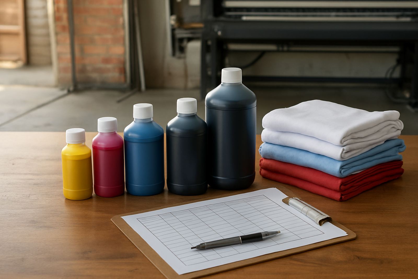
- Keep temperature, pressure and time written down.
- Change one variable at a time.
- Recheck the first sheet after any paper swap.
- Store unused transfer stock away from heat and dust.
Troubleshoot common dark area problems quickly
If the shadows look muddy, the print is probably carrying too much ink or too much contrast. If they look flat, you may have underbuilt the black channel or the colour balance is off. If the darks show streaks, the nozzles, paper feed or line cleaning may need attention before you print the next job. Do not keep chasing the colour while the mechanical side is still out of range.
A practical check list saves time when orders are due for collection or courier dispatch. Look at the file, then the printer, then the media. That order matters because many dark tone issues are caused by a small fault in one part of the chain. Our team often sees the same pattern on startup jobs and bulk orders: once the source of the problem is identified, the rest becomes much easier to keep under control.
- Check for nozzle loss before adjusting the file.
- Inspect paper feed for skew or slipping.
- Look for over-pressed or over-heated samples.
- Confirm the ink set is correct for the printer.
Build a repeatable dark tone check for every batch
Once you find a setting that gives clean shadows and stable black density, make it part of the routine. Use the same test image, the same paper, and the same viewing light each time you approve a batch. If the room light changes from cool white to yellow, the dark areas can appear different even when the print itself is fine.
A simple batch check works well for trade customers who print every week. Keep one approved sample, compare it to the new run, and note anything that shifts in the blacks or neutral greys. If the result is outside tolerance, stop the run before wasting more sheets. That discipline protects both margin and turnaround times, especially when courier collections are already booked.
Dark tone control is about consistency more than drama. When the blacks stay clean, the shadows keep shape and the colour holds together across the whole print.