
Why CMYK Balance Matters in Daily Production
In sublimation and other transfer work, colour problems usually start before the press touches the garment. If one channel is too heavy or too light, the final print can look dull, too warm, too cool or simply inconsistent from one batch to the next. Balanced CMYK usage gives you steadier skin tones, cleaner darks and better control over brand colours.
For South African print shops that handle school wear, sports kits, corporate gifts and short-run promotional items, consistency matters just as much as brightness. A customer may not know the exact ink mix, but they will notice when last month’s navy looks different today. That is why a sound colour routine saves time, reduces reprints and keeps wastage down.
It also helps with planning stock. When you know which colours are being pushed hardest in your jobs, you can keep the right volumes on hand and avoid running short during a busy week in Johannesburg or on a Friday before courier cut-off.
What Each Channel Does On Its Own
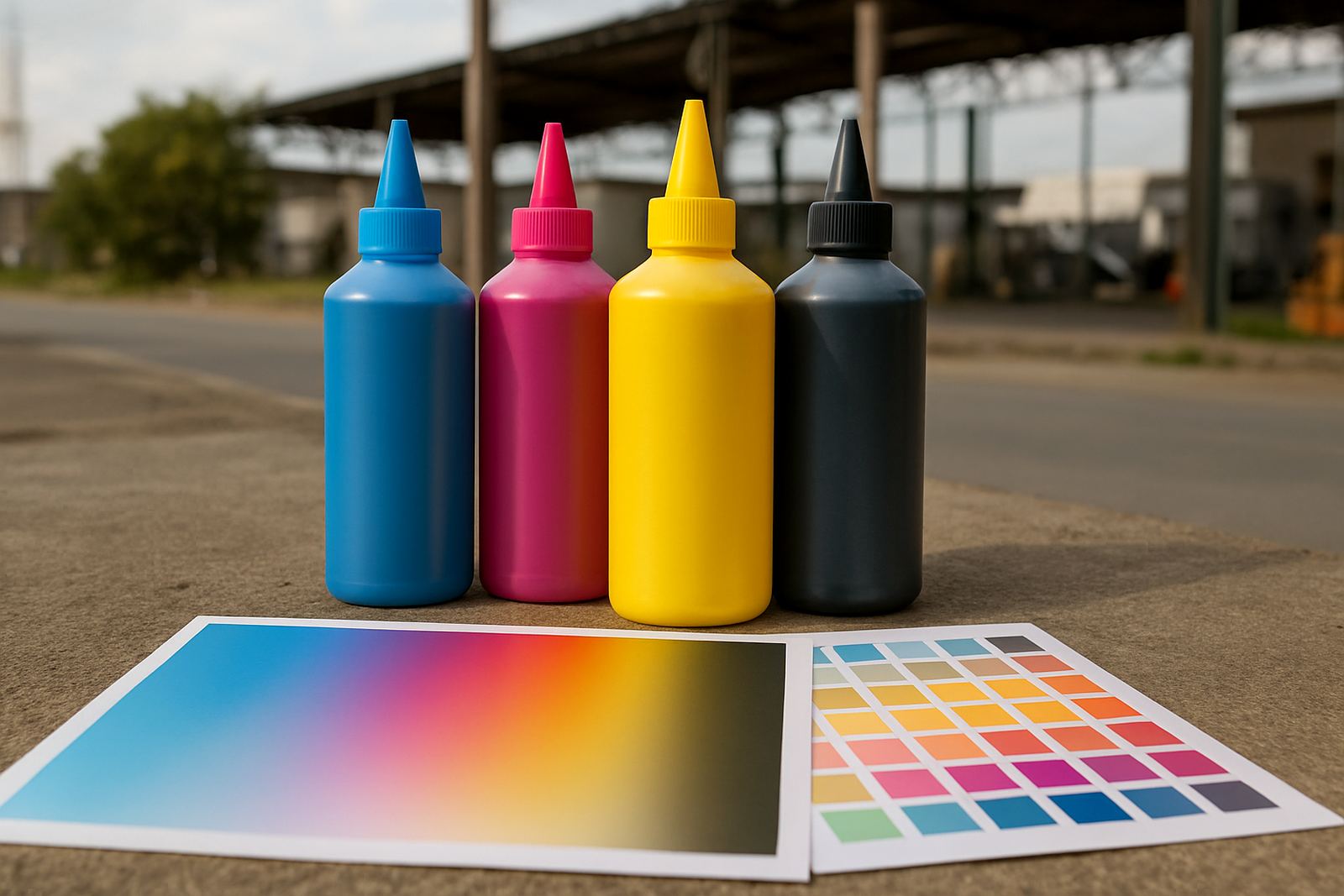
CMYK is simple on paper, but each channel carries a different job in the print. Cyan brings cool tones and helps shape blues and some greens. Magenta controls reds, pinks and a lot of the warmth in flesh tones. Yellow supports brightness and gives life to oranges, greens and light warm shades. Black deepens shadows, anchors neutrals and helps text stay clean.
When one channel is overused, the whole result shifts. Too much magenta can make a print look heavy and reddish. Too much cyan can pull a job cold and flat. Too much black can crush detail in dark artwork, while too little can leave greys looking washed out. The key is not to load every colour equally, but to match the mix to the artwork and the substrate.
- Use cyan carefully in blue-heavy artwork and cool corporate colours.
- Watch magenta in portraits, magenta packaging and bright pink designs.
- Keep yellow clean, as contamination shows quickly in pale tones.
- Use black for depth, not to fix every colour issue.
Signs Your Mix Is Out Of Balance
Most colour faults show up in a handful of repeatable ways. If the same file prints differently on two days, or if one side of a run is stronger than the other, the issue may be in ink balance, head condition or the print settings. In busy shops this can be missed because operators focus on speed, but the clues are usually there.
Look out for muddy greys, weak shadows, banding in solid areas and a colour cast that appears on every job, even when the artwork is different. A balanced system should let you print a grey and have it look neutral, not greenish or brownish. On fabrics, a balanced mix also helps reduce the risk of the shirt colour influencing the final image too much.
If your prints suddenly need extra adjustment to look right, do not just keep increasing the saturation. That can mask the problem for a while, but it usually creates a bigger colour mismatch later.
- Check whether one colour is running low or feeding unevenly.
- Inspect nozzles and line cleanliness before changing artwork files.
- Test on the same substrate, since paper and fabric can shift colour differently.
- Keep notes on the settings that produce the best repeat result.
How To Keep Colour Repeatable Across Jobs
Repeatability starts with routine. Use the same artwork file version, the same substrate, and the same print settings where possible. Then print a small test strip before starting the full run. This is especially useful for shops serving multiple areas like Randburg, Midrand and Pretoria, where jobs often move quickly from quote to dispatch and there is little time to rework a batch later.
Store inks correctly, keep lids closed and avoid letting bottles sit near windows or dusty prep areas. In Johannesburg summers, heat can affect handling, and in coastal areas humidity can influence storage and drying behaviour. If your workshop faces load-shedding, make sure printers are shut down safely and restarted in a controlled way so the line stays clear.
A simple colour log can make a big difference. Record the artwork type, substrate, printer used, time of day and any adjustments made. After a few weeks you will see patterns that help you predict how a job will behave. That saves money and reduces the guesswork when clients want the same colour again next month.
Practical Balance Checks Before You Run Production
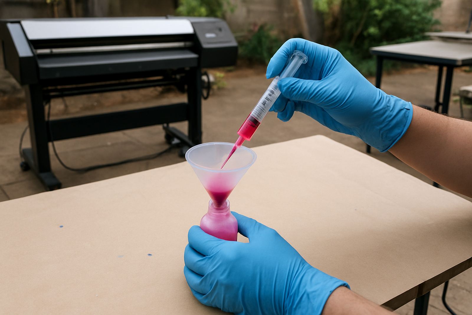
A few minutes of checking can prevent a full day of waste. Before a production run, look at nozzle checks, test prints and the condition of your lines. If a colour is failing, it may not be the ink formulation alone. Air in the line, partial blockages or poor refill habits can all throw the balance off.
For wide-format work, pay attention to how the colour behaves across the full width of the print. For smaller desktop machines, focus on whether the colour shifts from the first page to the last. In both cases, the goal is the same: stable output from start to finish.
- Run a nozzle check before every important batch.
- Compare a fresh test print to a saved approved sample.
- Shake or mix only as instructed for the specific ink type.
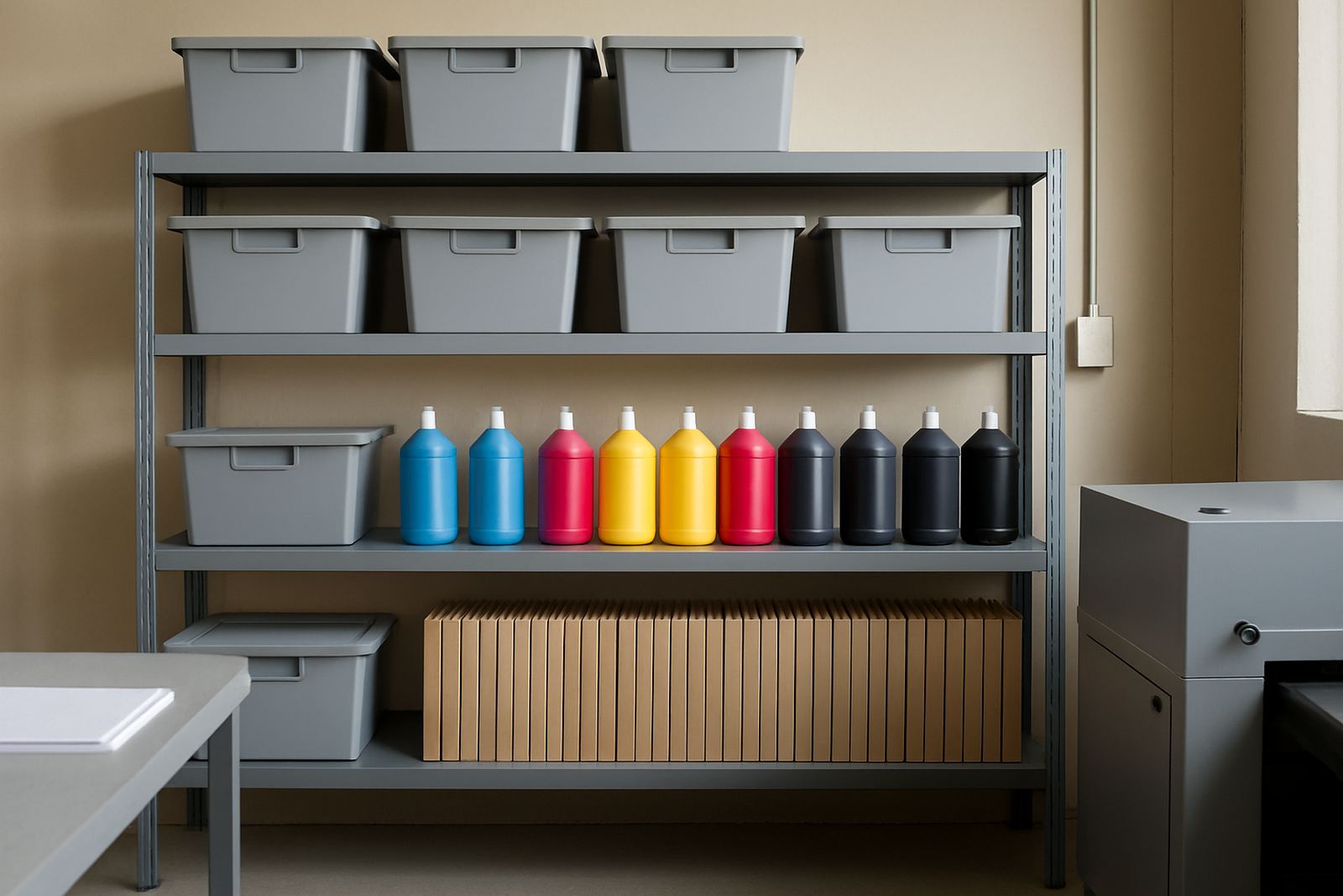
- Keep spare stock ready for busy courier days and month-end orders.
If a job still looks off after the basic checks, stop and isolate the issue before pushing ahead. A quick correction now is better than reprinting 50 metres of transfer film later.
A Johannesburg Example: Getting A Corporate Colour Right
A common local scenario is a corporate shirt order that needs to match an existing brand colour for a client in Sandton or Rosebank. The artwork may look correct on screen, but on fabric it can lean too red or too grey if the CMYK balance is not managed properly. In that case, the printer operator needs to check the colour mix, confirm the paper or film type and print a small sample before the full batch starts.
That same logic applies to garment decorators in Kya Sand, Roodepoort and East Rand who are working with mixed orders and tight collection times. A controlled colour process means fewer surprises when the courier arrives the next day and the client expects the same tone across every item. It also makes it easier to quote accurately, because you are not building in extra time for avoidable corrections.
Balanced CMYK is not about chasing perfect colour by eye every time. It is about building a process that gives the same result again and again, even when the workshop is busy, the weather changes or the power goes off for a while.
When To Ask For Help With Ink And Colour
If you are still getting unstable colour after checking files, heads, lines and settings, it may be time to get a proper compatibility check and colour troubleshooting support. Some issues come from the wrong ink for the machine, some from refill habits, and some from trying to stretch stock too far between orders. A good support process helps you match the ink to the printer, the job and the volume you actually handle.
Trade customers often need more than a single bottle. They need stock planning, sample order assistance, refill guidance and clear advice on how to keep output consistent from one week to the next. That is especially important for small teams, where one operator may manage everything from colour checks to courier handover. With the right support, balancing CMYK becomes a routine part of production, not a daily problem.
When colour is under control, the rest of the job becomes easier. Prints look cleaner, clients complain less and your production line keeps moving without extra waste.