
When good artwork still prints dull
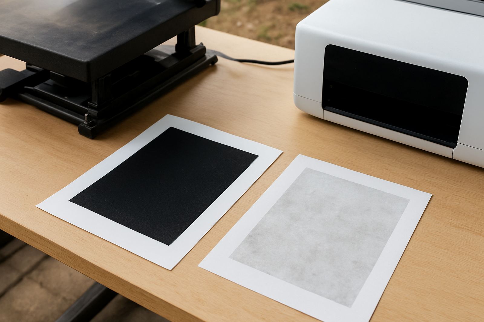
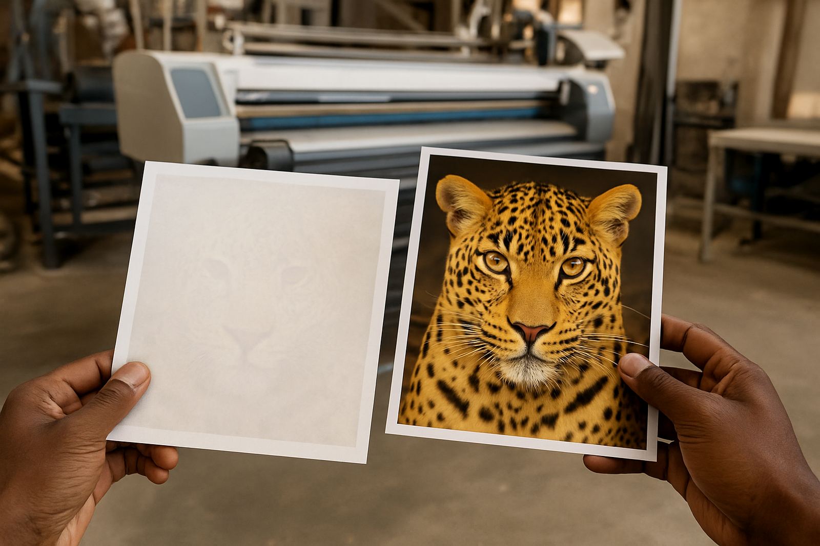
Many printers expect a bright file on screen to come out the same on press, but sublimation has a few steps where colour can drop off. If the print looks fine on paper and then washes out after pressing, the problem is often in the heat stage, not the artwork itself. A weak transfer can also come from low ink flow, the wrong substrate, or a profile that was never matched to the paper and printer combination.
In our Kya Sand base we often hear from trade customers in Randburg, Midrand and Pretoria who think the ink is failing when the real issue is a small change in temperature or dwell time. One degree too low, or ten seconds too short, can make reds look flat and blues lose depth. That kind of problem shows up quickly in garment decoration and screen print support work, where repeat colour matters from one run to the next.
Heat is usually the first place to check
Sublimation needs the right balance of heat, time and pressure for the dye to move cleanly into the coated surface. If the press runs cool, the colour may stay on the paper. If it runs too hot, you can get a washed look, yellowing, or a dull cast that makes dark tones seem tired. Uneven pressure can make one side of the print look stronger than the other, which is common on heat presses with worn pads or on jobs where the garment thickness changes.
- Check platen temperature with a separate thermometer, not only the panel display.
- Keep press time consistent from the first item to the last.
- Use even pressure across the full surface, especially on larger prints.
- Allow the press to recover between runs when you are doing bulk orders.
For shops in Johannesburg and the East Rand, load-shedding can also throw off workflow. If a press cools down during a break, the first few pieces after power returns may need a re-check. That small delay is better than sending out faded stock.
A bad profile can make strong ink look weak
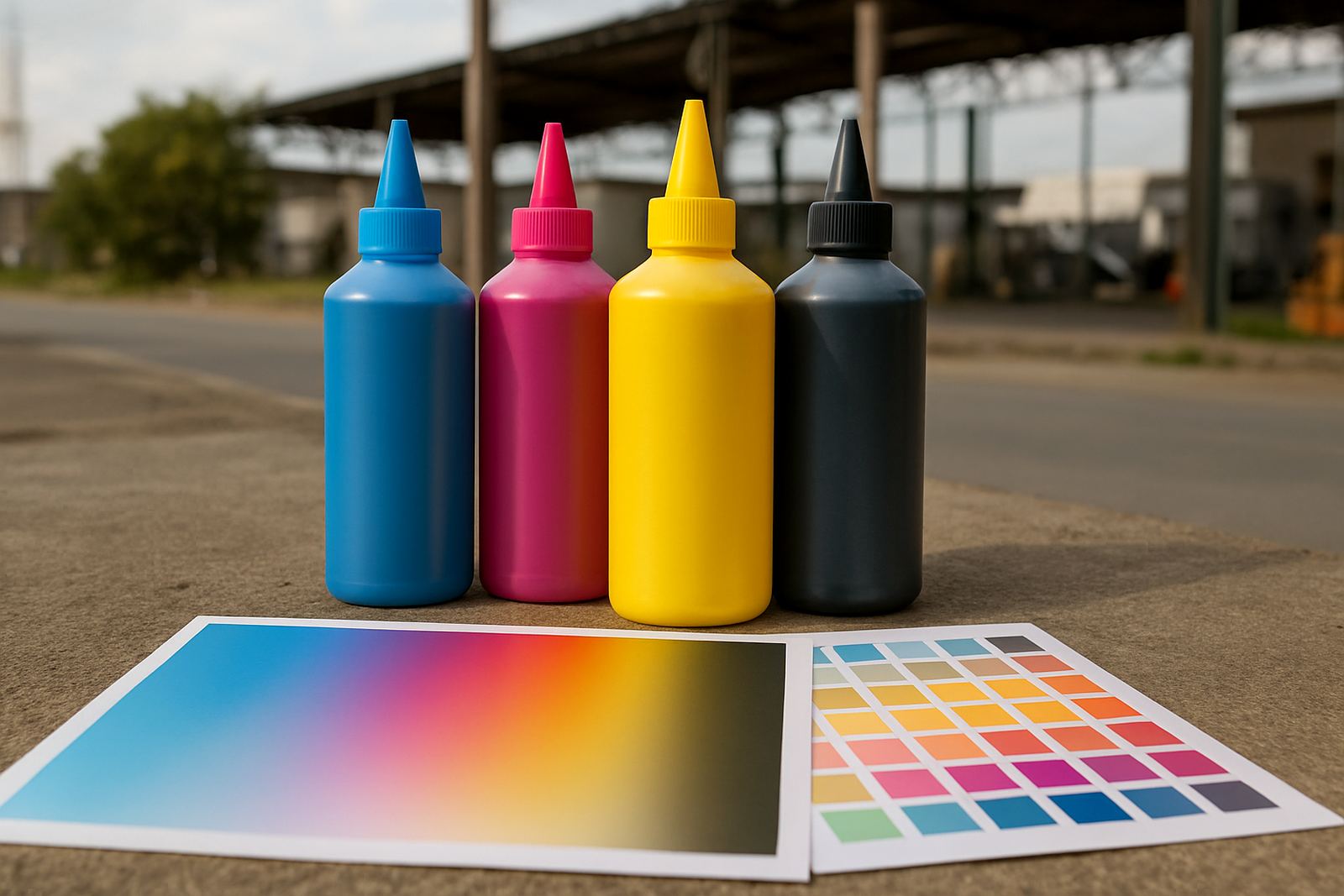
Profile problems are one of the most common reasons for colour fade complaints. A printer can lay down plenty of ink and still produce a soft looking print if the colour profile is too light, too dark, or built for the wrong paper. When the profile and ink set do not match, the transfer can lose richness and grey areas may pick up a colour cast.
It helps to test each printer, paper and substrate combination before a production run. Keep a simple record of what worked, including temperature, press time, humidity and paper type. In summer, especially around Sandton and Roodepoort, coastal moisture is not the issue, but humidity swings in enclosed work areas can still affect drying and handling. A print that is slightly over-wet may press differently from one that has had enough drying time.
- Use one confirmed colour setting for each printer and paper type.
- Keep test strips for future comparison.
- Recheck settings after maintenance or head cleaning.
- Store paper flat in a dry room, away from direct sun.
Ink supply trouble often starts before the bottle is empty
Exhausted ink supply does not always mean an empty tank. A line can start fading when there is air in the line, settled pigment, blocked nozzles or a weak refill routine. If one colour drops first, the print may still look usable at a glance but the transfer will lose punch after pressing. This is common on busy trade floors where staff are rushing between jobs and a quick top-up seems good enough.
Clean lines matter. If the system is not checked often, residue can build up and reduce flow. That means less colour on the paper and more chance of banding, patchy areas or a flat final print. Pieter on our technical side often advises shops to keep a regular nozzle check routine and to follow a proper refill method rather than topping up at random. A few minutes of discipline saves a lot of reprints, and it keeps the work moving.
Substrate choice can flatten colour fast
Not every coated item takes sublimation the same way. Polyester count, coating quality and fabric weave all change the final result. A shirt with a low polyester content will never hold colour like a high polyester garment. On hard goods, a poor coating can make bright ink look muted no matter how carefully the print was pressed.
Customers often ask why a sample looked strong and the bulk order looks duller. The answer is usually a different material batch, not the ink itself. Keep these checks in place before a run:
- Confirm the material type and coating on every new shipment.
- Compare the sample item with the production batch.
- Test a single piece before approving the full order.
- Watch for colour change on dark, textured or low-grade surfaces.
For small businesses in Kya Sand and surrounding areas, this is worth checking before promising a fast turnaround. It is better to catch a weak substrate early than to explain a faded batch later.
How to keep colour steady from job to job
Consistency comes from routine. Start with a proper compatibility check, then keep your press settings, paper type and ink stock the same for each repeat order. If a client reorders branded shirts for a school, team or promotion, do not change the setup unless you have to. Even a small change in drying time can shift the final tone.
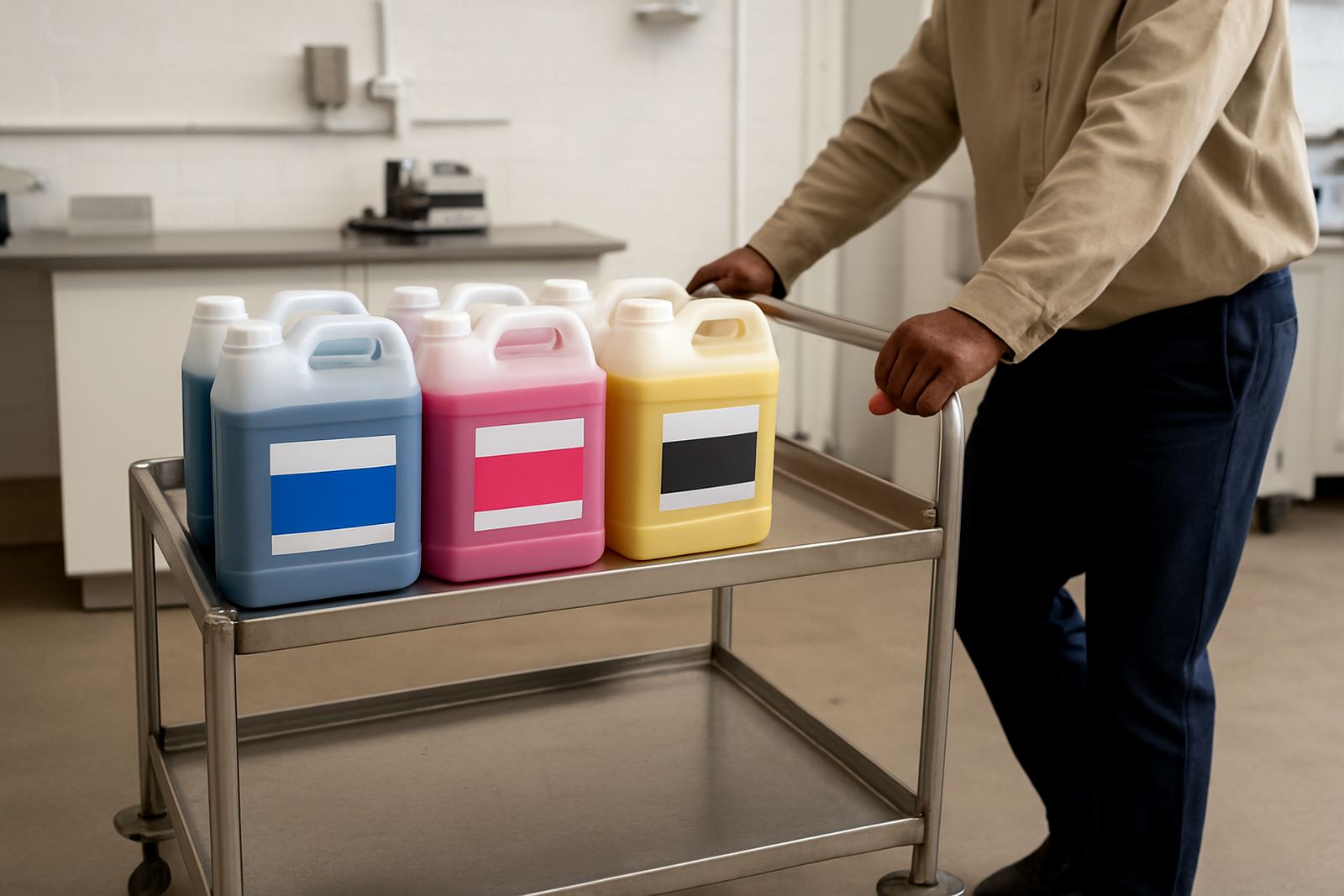
Stock planning also matters. Running low and mixing bottles at the last minute often leads to uneven results. Our team helps trade customers plan stock, match ink to the printer, and work out courier timing for next-day delivery nationwide. That is useful when a job is due in Pretoria tomorrow and the order needs to leave Kya Sand before the cut-off. With a clean setup and a steady supply, faded output becomes a rare problem instead of a weekly headache.